TwinCAT HMI Region and Content
(YouTube video link at the end)
Region
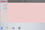
The region is a container for controls. The content to be displayed can be defined using the Target Content attribute. We can divide the screen into many regions as necessary. The main advantage of the region is better visibility and better user experiences. We can show or display related content in different regions. One of the main use cases is, for example, we want to show a static button on the left side all the time but the content of the right side changes as we press some other button to update the device status. Let’s take a look at our fictitious house automation system again as shown in the following image. As we see, we have at the top Status window where we want to display the status of the device. On the left side, we have some sample button that does not change whatever we show in the pink area. At the bottom we have some images, if we click on any of these images then related content is shown in the content area.
Download the complete sample RegionContent_Hemelix.zip
Content
Content control is an independent container object that can be loaded in a region. This control can be used, for example, to subdivide operating concepts into various contents. It is created under the TcHmi project tree with the context menu and adds a new Item.
We shall convert the view example to fit as a sample for region and content.
How to add region in visual studio:
=> From toolbox select region from the category HMI: System and drop it into the desktop area
=> Change the properties of the region such as width, height, color (press F4 to get the property window)
Note: It is better that we define the width, height, etc properties with server variables and with % as compared to desktop size. The reason is that we need to hide the desktop area and its color (or we have to put some other mechanism)
We have the following region,
Left sidebar, the ID is TcHmiRegion_LeftSideBar
Bottom menu where have the image icons, the ID is TcHmiRegion_Navigation
Main content area, the ID is TcHmiRegion_ContentArea
The top status region, the ID is TcHmiRegion_StatusBar
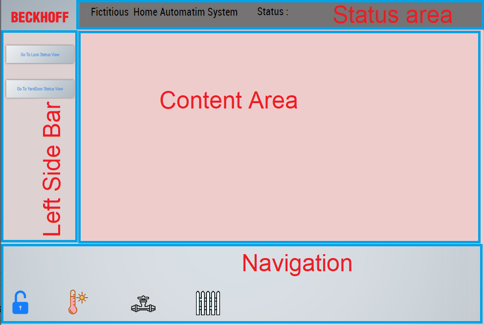
Figure 1: Desktop.view has been divided to many areas depending our need
If we press on the gate icon then the related status is shown on the top status area and the left-hand side button remains same. The buttons are located in different regions, it is shown here just to show the possibilities.
We have preserved the functionalities of the View sample (https://www.hemelix.com/scada-hmi/twincat-hmi/twincat-hmi-view/) in this region sample. If we press the lock button we load the lock content to the main region while other regions are not touched or changed. We have removed the back button from the view sample as it is not necessary in this case.
Content
A content control is an independent container object that can be loaded in a region. This control can be used, for example,
to subdivide operating concepts into various contents. It is created under the TcHmi project tree with the context menu Add new Item.
How to create content in the visual studio:
=> Create a folder in the VS solution such as Contents
=> In the new folder, select Add | New Item (rename it as it fits)
=> Decorate the new content page as necessary, we have 4 content pages in our example.
=> We inserted 4 images in the bottom area where we can click on an image and then we show the related content in the content area. In this case, we modify the properties of the image event (onPressed event)
Lock Content:
In our fictitious home automation system we have a door in the main building. We control the door remotely by using our automation system. We can lock and unlock the door by using the HMI.
=> We create content for the lock to display button and the status of the lock, the following two images show the design and actual live view.
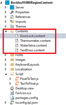
Figure 2: Visual Studio solution explorer view, showing 4 contents
The following image is the design view of the DoorLock.content
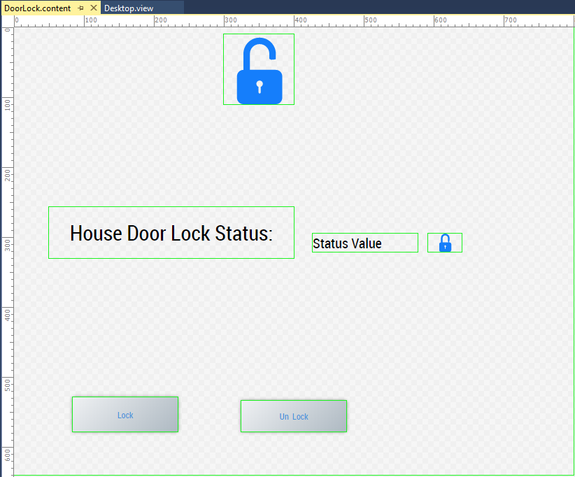
Figure 3: Design of lock view (note that this is fictitious stuff)
The following image is the lock status view of the sample while the HMI is running.
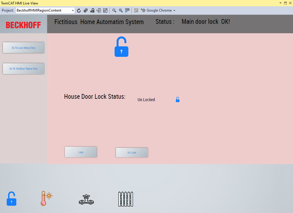
Figure 4: Lock view while running the HMI (if we press on the icon in navigation area corresponding content is loaded)
Here is how the technique that shows how do we modify the content of the content area. When we are pressing on the lock image then we update the symbols. We tell the framework where it should display, in this sample TcHmiRegion_ContentArea::TargetContent is set to Contents/DoorLock.content
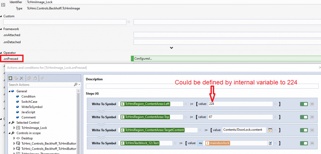
Figure 5: How the lock view is loaded, when we press on the lock in the navigation area
YardDoor Content:
In our fictitious home automation system we have a yard for the house. We need to open the yard door before entering the house. We can press the button on our mobile devices to open it. We should be able to open the door by our HMI even we can scan the car registration plate so the door can be opened when a particular car comes in front of the gate. We control the gate remotely by using our automation system. We can open and close the gate by using the HMI.
=> We create content for the yard gate to display button and the status of the gate, the following two images show the design and actual live view.
The following image is the design view of the YardDoor.content

Figure 6: Yard gate view for our automation system, if we press on the open button it should open the gate.
The following image is the yard gate view of the sample while the HMI is running
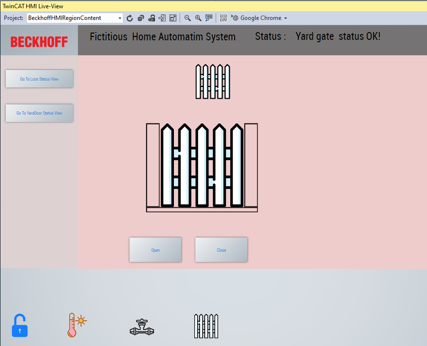
Figure 7: Yard gate view when the HMI is running
Here is how the technique that shows how do we modify the content of the content area for yard gate. When we are pressing on the gate image then we update the symbols. We tell the framework where it should display, in this sample TcHmiRegion_ContentArea::TargetContent is set to Contents/YardDoor.content.
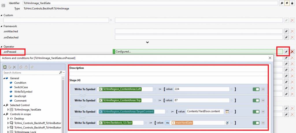
Figure 8: How yard gate is loaded when we press on the yard door in the navigation area
We have shown design of only 2 contents area and how those are loaded in the target region, other views can be designed and configured in the similar way.
HMI Navigation
The desktop view is the start page for any application on which we can create by using Visual Studio Wizard for visualization purposes. There are no hard rules for how we design the user interface. Look and feel, usability are the different factors that define how the UI will be structured.
A good method of increasing the tidiness is to split the visualization into various parts. To do this, divide it into various content objects.
These content objects can be displayed in different areas of the desktop view. For example, the visualization could be divided into three areas in the desktop view: a status bar, a content area, and a navigation bar area. Various content objects can be displayed in the content area during the runtime.
The contents of the status bar area and the contents of the navigation bar area can also be changed as needed. We shall design the HMI for our fictitious home automation system. The first page will show the logo and there will be navigation at the bottom. Following is a recommended way by Beckhoff.
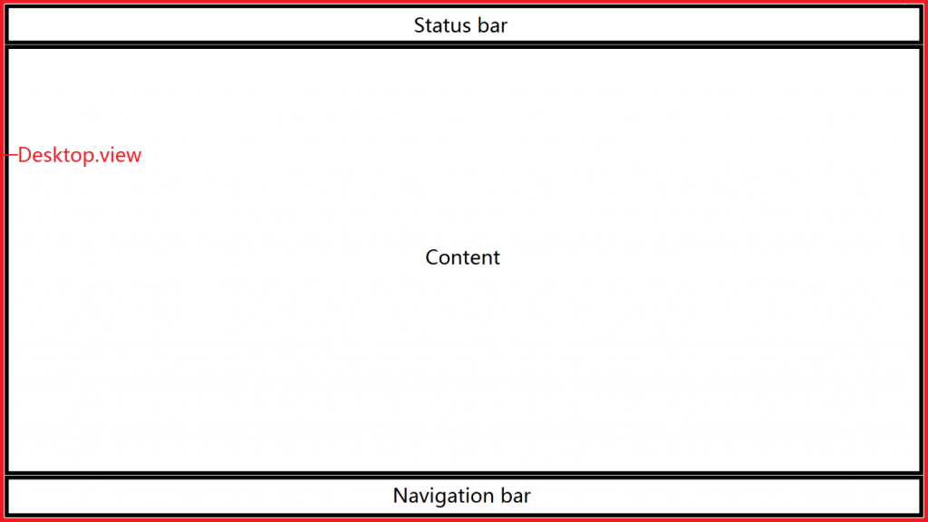
Figure 9: Navigation (from Beckhoff site)
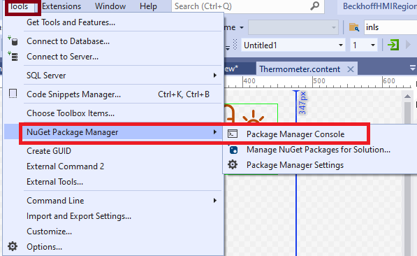
Tips 01: We may have a mismatch between the Nuget package from one TwinCAT HMI framework version to another. In this case, we need to update the Nuget package.
Tips 02: Sometimes the updated NuGet packages may not work directly, it can give a strange problem, one solution select the Nuget Package Manager Console and type
dotnet restore
Download the sample from the link given above.
Next, let’s try to understand what is a checkbox at https://www.hemelix.com/scada-hmi/twincat-hmi/checkboxcombobox/
Ask questions related to Hemelix sample code and design at Google group https://groups.google.com/g/hemelix