CheckBox and ComboBox (Video link below)
Check box:
A checkbox is a graphical widget that permits the user to make a binary choice, i.e. a choice between one of two possible mutually exclusive options. For example, the user may have to answer ‘yes’ or ‘no’ on a simple yes/no question. In automation terms, it can be either TRUE or FALSE.
Download the sample CheckBoxComboBox_Hemelix.zip
Combo box:
A combo box is a commonly used graphical user interface widget. Traditionally, it is a combination of a drop-down list or list box and a single-line editable textbox, allowing the user to either type a value directly or select a value from the list. The term “combo box” is sometimes used to mean “drop-down list”.
In most use cases, we read the value from the HMI and do something based on this for example to our PLC program. Or if the program has selected an option automatically that can be set in the HMI so user can see what the system is doing.
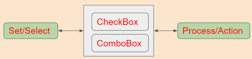
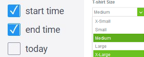
Figure 1: Combobox and Check box, user action is processed
In the sample, as shown in figure 2, we are showing 3 different ways of setting the combo and checkbox. We have a check box and combo box in each sample. If we press on the Run Mode check box then Active is written in the Run Mode text block. Otherwise, it will show Normal. If we check the Set check box then the Run Mode check box is checked and the corresponding text block is updated.
We shall show 3 ways to achieve this:
=> Option 1: In this way, no code is used just by configuration.
=> Option 2: In this way, JavaScript code is used to manipulate and achieve the same result.
=> Option 3: In this way, C# extension is used to achieve the same result (slightly other 2 options has been used here as well)
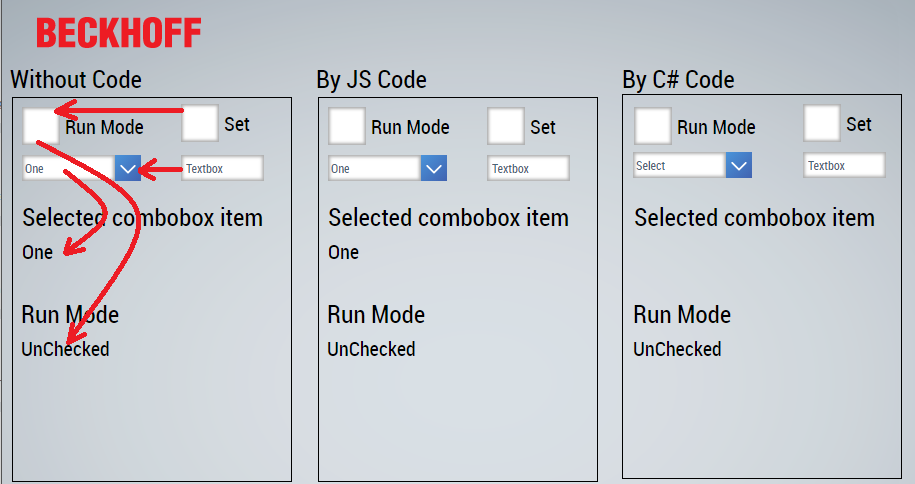
Figure 2: Main user interface of the sample application
Since we are trying to achieve the same result, we place all the user interface modules in a similar way. We shall use the word config (for option 1), JS for option 2, and CSharp for option 3 (see figure 3)
=> Create a simple HMI program
=> Insert 3 rectangles from the toolbox and arrange those (also indicates that rectangle by text block on the top)
=> Insert 2 checkboxes (identifier TcHmiCheckbox_Config and TcHmiCheckbox_ConfigSet )
=> Insert 1 com box (identifier TcHmiCombobox_XX) in all rectangle (When user select an item the item name will be displayed)
=> Insert 1 text box (identifier TcHmiTextbox_XXComboBoxSet) in all rectangle (When user type 0 then first item will be selected)
(Download the sample and check it in VisualStudio)
=> Insert 2 text blocks (identifier TcHmiTextblock_XXComboBoxValue and TcHmiTextblock_XXCheckBoxValue) in all rectangle for displaying combo box and check box content as shown in figure 2.
XX can be config, JS or CSharp depending on the case.
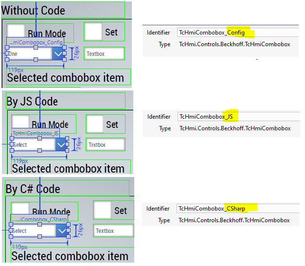
Figure 3: Main user interface design for combo box
Design of combo box:
=>For without code case, select the combo box, go to the properties window, and press on the ellipse (…)
=>Add 4 items, one, two, etc with ID, value, and Text
=>For JS and CSharp cases, those data will be added by program so we leave the srcData field empty
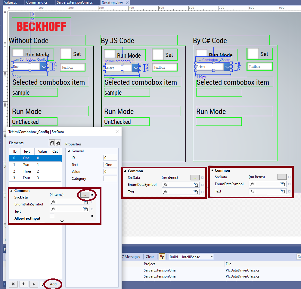
Figure 4: Data design of combo box, SrcData field is empty for JS and CSharp case (added by program)
Combo box selection, without any code
When an item in the combo box is selected, that text is displayed to text block (TcHmiTextblock_ConfigComboBoxValue)
To configure this,
=> Select the combo box | event (lightening bolt) and onSelectionChanged (click on the edit pen) and tell the system when the text is changes then get the text of the selected item and set it to the text block as shown in figure 5.
=>When user type 0 to 3 in the textblock then we set the combo box selected index to this that causes again to update the text block.
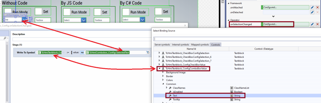
Figure 5: Getting data from the combo box and setting it to text block
Check box selection, without code:
When the check box is selected, then Normal or Active text is displayed to text block (TcHmiTextblock_ConfigCheckBoxValue)
To configure this,
=> Select the check box | event (lightning bolt) and onToggleStateChanged (click on the edit pen) and tell the system when the state is changed then write the text Active or Normal (to TcHmiTextblock_ConfigCheckBoxValue) as shown in figure 6.
=> When we set the check box “Set” then it is duplicated to the Run Mode check box, interns the Run Mode text block is updated.
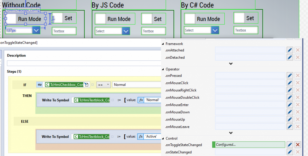
Figure 6: Getting data from the check box and setting it to text block
Now, this is ready for the config mode. There might be some settings missing (for example what it should show when the application starts). Please check the details by browsing the code.
Combo box selection, by JavaScript(JS)
Now, we are talking about the second case, the JavaScript case, in this case, when the combo box is attached then we add the SrcData (one, two, etc) by JavaScript as shown in figure 7.
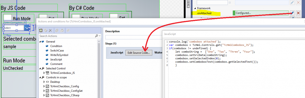
Figure 7: Attaching data to combo box
We can insert some JavaScript code when the selection in the combo box is changed. We get a reference to the combo box and text block. We get the combo box’s selected text and set the text to text block (TcHmiTextblock_JSComboBoxValue). The code snippet is shown below.
console.log('combobox selection changes');
var combobox = TcHmi.Controls.get("TcHmiCombobox_JS");
var comboboxValue = TcHmi.Controls.get("TcHmiTextblock_JSComboBoxValue");
if(comboboxValue != undefined && combobox != undefined) {
    comboboxValue.setText(combobox.getSelectedText());
 }
When the check box state is changed then we update the text block almost similar way as shown in the following code snippet.
console.log('JS CheckBox Status Changed');
var checkbox = TcHmi.Controls.get("TcHmiCheckbox_JS");
var textBlockCheck = TcHmi.Controls.get("TcHmiTextblock_JSRunModeValue");
if(checkbox != undefined && textBlockCheck != undefined) {
let state = checkbox.getToggleState();
if(state=='Normal') {
    textBlockCheck.setText('Normal');
} else
    {
        textBlockCheck.setText('Active');
    }
}
Check box set, by JS
When the Set Check box state is changed the following JavaScript code is called. It gets the state of TcHmiCheckbox_JSSet (Set check box) and update the status of the main check box.
console.log('JS CheckBox Set Status Changed');
var checkbox = TcHmi.Controls.get("TcHmiCheckbox_JS");
var checkboxSet = TcHmi.Controls.get("TcHmiCheckbox_JSSet");
if(checkbox != undefined && checkboxSet != undefined) {
let state = checkboxSet.getToggleState();
if(state=='Normal') {
    checkbox.setToggleState('Normal');
} else
    {
        checkbox.setToggleState('Active');
    }
}
Achieving the same effect by C# extension module
In this option, we are achieving the same effect by extension module (if you are not familiar with the extension module please take a look at https://www.hemelix.com/scada-hmi/twincat-hmi/twincat-hmi-server-extension/ )
We create a list of combo box items (one, two etc) during the initialization of the module by the following code.
public ErrorValue Init() {
  this.requestListener.OnRequest += this.OnRequest;
  comboTextList.Add("One");
  comboTextList.Add("Two");
  comboTextList.Add("Three");
  comboTextList.Add("Four");
  comboString = JsonConvert.SerializeObject(comboTextList);
  return ErrorValue.HMI_SUCCESS;
}
The combo string is returned to HMI by the following code.
switch (command.Mapping) {
case "ComboString":
  {
    command.ReadValue = comboString;
    command.ExtensionResult = ServerExtensionOneErrorValue.ServerExtensionOneSuccess;
    command.ResultString = "Unknown command '" + command.Mapping + "' not handled.";
  }
  break;
We get the data by calling server object from the extension module ServerExtensionOne.ComboString. Since the extension module returns JSON string as expected by the combo box. This is called during the .onAttached event.
We also monitor the combo box index, when it is changed, we read the value and set it to the extension module. Extension module format the variables and then those variable are set to the HMI.
Part of ServerExtensionOne.Config.json
{
  "$schema": "ExtensionSettings.Schema.json",
  "configVersion": "1.0.0.6",
  "guid": "ff0d9684-8526-47f4-aae5-dd932d2cae8f",
  "version": "1.0.0.0",
  "policies": [
    "StrictPropertyValidation"
  ],
  "symbols": {
    "InitModule": {
      "readValue": {
        "$ref": "tchmi:general#/definitions/String"
      },
      "hidden": false
    },
    "ComboString": {
      "readValue": {
        "$ref": "tchmi:general#/definitions/String"
      },
      "hidden": false
    },
    "ComboIndex": {
      "readValue": {
        "$ref": "tchmi:general#/definitions/String"
      },
      "hidden": false
    },
    "RunMode": {
      "readValue": {
        "$ref": "tchmi:general#/definitions/String"
      },
      "hidden": false
    },
    "SetMode": {
      "readValue": {
        "$ref": "tchmi:general#/definitions/String"
      },
      "hidden": false
    },
    "SetComboIndex": {
      "readValue": {
        "$ref": "tchmi:general#/definitions/String"
      },
      "hidden": false
    }
  }
}
Actual function where we make the srcData for Combobox are shown in the following snippet
private void OnRequest(object sender, TcHmiSrv.Core.Listeners.RequestListenerEventArgs.OnRequestEventArgs e) {
  try {
    e.Commands.Result = ServerExtensionOneErrorValue.ServerExtensionOneSuccess;
    foreach(Command command in e.Commands) {
      try {
        // Use the mapping to check which command is requested
        switch (command.Mapping) {
        case "ComboString":
          {
            command.ReadValue = comboString;
            command.ExtensionResult = ServerExtensionOneErrorValue.ServerExtensionOneSuccess;
            command.ResultString = "Unknown command '" + command.Mapping + "' not handled.";
          }
          break;
        case "RunMode":
          {
            if (command.IsSet == true && command.WriteValue != null) {
              string val = command.WriteValue;
              if (val.Contains("Active") == true) {
                runMode = "Active";
              }
              else {
                runMode = "Normal";
              }
            }
            else {
              command.ReadValue = runMode;
            }
            command.ExtensionResult = ServerExtensionOneErrorValue.ServerExtensionOneSuccess;
            command.ResultString = "Unknown command '" + command.Mapping + "' not handled.";
          }
          break;
        case "SetMode":
          {
            if (command.IsSet == true && command.WriteValue != null) {
              string val = command.WriteValue;
              if (val.Contains("Active") == true) {
                runMode = "Active";
              }
              else {
                runMode = "Normal";
              }
            }
            else {
              command.ReadValue = runMode.ToString();
            }
            command.ExtensionResult = ServerExtensionOneErrorValue.ServerExtensionOneSuccess;
            command.ResultString = "Unknown command '" + command.Mapping + "' not handled.";
          }
          break;
        case "SetComboIndex":
          {
            if (command.IsSet == true && command.WriteValue != null) {
              string val = command.WriteValue;
              comboSelection = val; //Error check
            }
            command.ExtensionResult = ServerExtensionOneErrorValue.ServerExtensionOneSuccess;
            command.ResultString = "Unknown command '" + command.Mapping + "' not handled.";
          }
          break;
        case "ComboIndex":
          {
            int aint = 0;
            try {
              aint = Convert.ToInt32(comboSelection);
            }
            catch(Exception ex) {
              if (comboSelection.Contains("One")) {
                comboSelection = "0";
              }
              if (comboSelection.Contains("Two")) {
                comboSelection = "1";
              }
              if (comboSelection.Contains("Three")) {
                comboSelection = "2";
              }
              if (comboSelection.Contains("Four")) {
                comboSelection = "3";
              }
            }
            if (aint > 3 || aint < 0) {
              comboSelection = "0";
            }
            command.ReadValue = comboSelection.ToString();
            command.ExtensionResult = ServerExtensionOneErrorValue.ServerExtensionOneSuccess;
            command.ResultString = "Unknown command '" + command.Mapping + "' not handled.";
          }
          break;
        case "InitModule":
          {
            command.ExtensionResult = ServerExtensionOneErrorValue.ServerExtensionOneSuccess;
            command.ResultString = "Unknown command '" + command.Mapping + "' not handled.";
          }
          break;
        default:
          command.ExtensionResult = ServerExtensionOneErrorValue.ServerExtensionOneFail;
          command.ResultString = "Unknown command '" + command.Mapping + "' not handled.";
          break;
        }
      }
      catch(Exception ex) {
        command.ExtensionResult = ServerExtensionOneErrorValue.ServerExtensionOneFail;
        command.ResultString = "Calling command '" + command.Mapping + "' failed! Additional information: " + ex.ToString();
      }
    }
  }
  catch(Exception ex) {
    throw new TcHmiException(ex.ToString(), ErrorValue.HMI_E_EXTENSION);
  }
}
}
Tips
If you run the application, you notice that those PLC variables are updated but UI does not update as we expect. The mistake we did that we copied the content. If we copy the contents then actually we are copying the ID of the contents. If we edit in the new page then it means we are editing also in the original page.
Tips 01: Don’t copy contents or if you do then remember this problem.
Tips 02: When we want to select one of the item at the beginning , we can do it during .onAttachedEvent, as shown in the example
Tips 03: We have some case where we have many items in the combo box, then we need to increase the MaxListHeight as shown in the following figure.
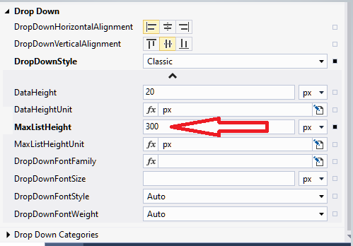
Figure 8: When we have many items in combo box we need to increase the MaxListHeight field
Tips 04: If we pass ‘Active’ or ‘Normal’ from base to popup, we can set the checkbox as shown in the following figure. If we have true or false then we must convert to ‘Active’ or ‘Normal’
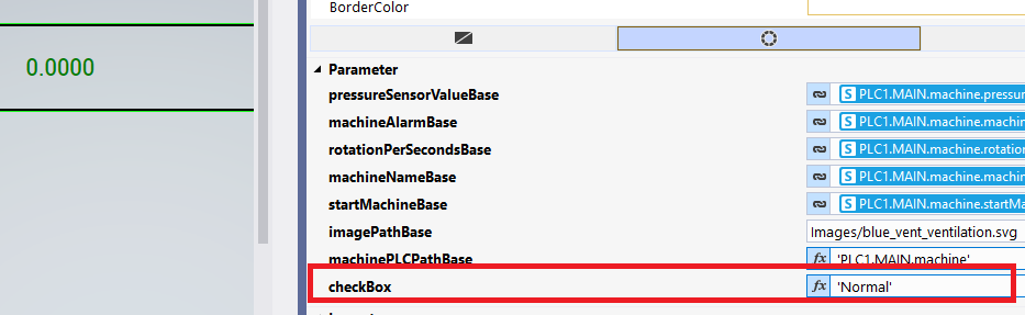
Figure 9: Passing Active or Normal
If you like our content, you could help us by sharing it.
Download the sample from the link given above.
Next, let’s try to understand what is a Data Grid view at https://www.hemelix.com/scada-hmi/twincat-hmi/data-grid-view/
Ask questions related to Hemelix sample code and design at Google group https://groups.google.com/g/hemelix